Decorating Made Easy: Decorating with the 60-30-10 Rule

The 60-30-10 rule is a tested concept used by interior decorators everywhere.  It’s a simple proportion that spells out the ideal amounts of color to use in your decorating.

To keep it as simple as possible, 60% of your room should be composed of your dominant color, 30% should be composed of a secondary color and that final 10% should be reserved for accents.  Now, maybe that sounds a little confusing . . . so here are some examples:

This room is a perfect example of the 60-30-10 rule in practice. 60% = Lavendar (walls and blanket) 30% = White (bed and fireplace) 10% = brown/tan (chairs, dresser, floor)

This room is a perfect example of the 60-30-10 rule in practice.
60% = Lavendar (walls and blanket)
30% = White (bed and fireplace)
10% = brown/tan (chairs, dresser, floor)


Another great example: 60% = Tan (walls, floors) 30% Brown (couch, tables) 10% Blue and White (pillows, vases, etc.)

Another great example:
60% = Tan (walls, floors) 30% Brown (couch, tables)
10% Blue and White (pillows, vases, etc.)


A classic example showing that you don't need a soft, muted color on your walls to make this work. 60% = Red (walls, accessories) 30% = Cream (furniture, rug) 10% = Tan (floor, accessories)

A classic example showing that you don’t need a soft, muted color on your walls to make this work.
60% = Red (walls, accessories)
30% = Cream (furniture, rug)
10% = Tan (floor, accessories)


Another great example that clearly demonstrates that the main color doesn't need to be calm, simple, neutral or BORING! 60% = Green (walls, accessories) 30% = White (furniture, art prints) 10% = Dark Brown (floors, chair legs)

Another great example that clearly demonstrates that the main color doesn’t need to be calm, simple, neutral or BORING!
60% = Green (walls, accessories)
30% = White (furniture, art prints)
10% = Dark Brown (floors, chair legs)

 An example that proves you can use the 60-30-10 rule to work incredibly vibrant and bold colors smoothly into your decorating. 60% = Blue (walls, light) 30% = Pink (bedspread, chair, painted leaves) 10% = White (trim, doors)

An example that proves you can use the 60-30-10 rule to work incredibly vibrant and bold colors smoothly into your decorating.
60% = Blue (walls, light)
30% = Pink (bedspread, chair, painted leaves)
10% = White (trim, doors)

The color options are endless and it’s not difficult to see that using this rule helps you keep your color scheme under control and helps you produce an end result that’s very focused, very clean and very inviting!

Get Creative! Projected Images, Stencils, and Silhouettes

jenisonBy Guest Writer, Shannon VandenBosch

When it comes to creativity, I need some inspiration.  So I go to a few decorating magazines and/or peruse my “Favorites” list of websites for design ideas.  When I feel I have found a few pictures representing the style, image, or technique I would like to achieve, it becomes my muse.  This is when I breathe a sigh of relief because the mental work is done and I can begin the process of tweaking the look I have found in order to make it my own style statement.

Recently, I was challenged to take a blank wall in our recently remodeled RepcoLite store in Jenison, Michigan, and create interest, and hopefully, inspiration.  This empty wall space was located directly above the counter area where customers would sit and contemplate their own design decisions by beginning to choose a color or palette of coordinating colors.

Immediately, I liked the concept of stenciling or projecting an image on the wall to create a mural.  I recalled seeing a large, abstract, flower in a Benjamin Moore color brochure.  Aha!!  The inspiration, my muse!

I began by taking measurements of the wall space and calculated the size of a single petal needed to make the flower, the length the stem needed to be, and the size of a single circle.  Color choices were made to compliment the store’s interior decor.  The single petal and circle were cut out of cardboard and then stenciled or traced onto the wall.  The stem was drawn free-hand in proportion to the flower. Then the image was painted with interior wall paint. The whole process took about 6 hours. (See picture above–or, better yet, stop at our Jenison store and see it in person!)

As alluded to earlier, other ways to create murals is to use a projector to cast an image on a wall and either trace it and then paint or begin painting the image . Click here and here for more info.  You can also check out this site for some more examples of graphic murals. Silhouettes are created by drawing and then painting a picture of something, say a headboard, on the wall instead of actually using a real headboard. This technique is not only creative, but inexpensive! Take a look at current decorating magazines for more information on this technique. Stencils not only can be made but bought at local stores that sell wallcoverings, crafts, or interior decorating items.

I hope you have been inspired to get creative and make the next space you choose to decorate even more uniquely yours.

Quick Project: Paint an Accent Wall

14b_bedroom_darklilac2070_30_lavendarmist2070-60 It’s been a while since we tossed up a “quick hitter” project–a project that should take you less than a couple hours and cost you less than $40–so I thought I’d pitch this one to you:  painting an accent wall.

Painting an accent wall is an ideal project for the decorator on a budget.  You can usually get by with less than a gallon of paint and the time it takes to paint one wall is, typically, about 1/4 of the time it takes to paint an entire room.  (I’m throwing fractions around here just to show off  my vast knowledge of math.)

Alright, with that said, let’s clarify what we’re talking about here.  Painting an accent wall means taking a wall–the focal point of the room–and painting it a different (typically darker) color than the rest of the room.  And that’s it.  You don’t paint the other 3 walls, you don’t repaint your trim or your ceilings.  You paint one wall a different color than the other 3 and you’re done.

Now, while that sounds easy, there are a couple things to think about when you tackle this project:

PICK THE RIGHT WALL

This is probably the biggest question folks deal with when they tackle this accent wall project:  which wall do I choose?  Typically, the answer you’ll get from paint people and do-it-yourself decorators alike is “paint the first wall you see when you walk into a room.”

Now, while that may not be always wrong, it’s certainly not always right.  The correct answer is this:  “paint the wall that your eye is naturally drawn to after you’ve entered a room.”

For example, if you walk into a bedroom, often times, as you approach the room, the first wall you see through the doorway is the side wall.  Once you enter the room, your eye doesn’t linger there, though.  Instead, your eye is naturally drawn to the wall that the bed stands against.  That wall is the “focal” wall, the wall that you should consider for your accent wall.

So don’t spend so much time considering which wall you see first upon entering a room.  Instead, spend more time looking around and noticing where your eyes are drawn.  If you’ve got a fireplace in a living room, that wall is typically the focal wall.  Painting an accent color against that wall will make your fireplace stand out, will draw attention in that direction and will give your room that “designer feel.”  Other typical, natural focal points can be large paintings or a mirror, dominant pieces of furniture (a couch against a wall for example), or even an archway or a set of french doors.  The walls that these items sit against, on, or in are candidates for the focal wall of the room.

PICK THE RIGHT COLOR13a_chestvignette_SmolderingRed_2007_10

Once you’ve selected the right wall for your project, the next thing to consider (and, honestly, the last thing) is this:  what color?

Often, when we hear the word “accent color” we think of orange.  Or red.  Or bright green.  Or maybe a dark, dark blue.  Basically, we think of bold, crazy colors.  But don’t limit yourself in that regard.

Always remember that the depth or “boldness” of a color is subjective–it’s determined largely by the colors around it.  If you’ve got a soft tan or an off white on all the walls of a room, even a mid-range blue or an earthy green would function as an “accent color”.  In fact, an orange in a room like that would be really difficult (not impossible, but difficult) to pull off.

Conversely, if you have a room of medium to dark tones, you could go either direction.  A bold orange, green, red, blue, brown could potentially be a tremendous accent color to put on that one focal wall.  But, so also could an off white.  If the rest of your room has some color and depth to it, even an off white can function as an accent color.

So, all that to say, don’t limit yourself (and scare yourself away from the project) by thinking that in order to do the project justice, you’ll need to pop open a can of “safety orange” and kiss your calm, peaceful room goodbye.

A great way to pick a color for an accent wall is to look to your fabrics–pull one of the colors out of the throw pillows on the couch or the comforter on the bed.  Look to any art you have on the walls–is there a color in there that would look great on one single wall of the room–possibly the wall the picture itself is hanging on?  What about the carpet?  The window treatments?

Anyway, you get the idea.  Find a wall, pick a color and spend a couple hours this weekend or next painting that one single wall and you’ll be amazed at the results!

Quick Project: Striped Frames

striped_frames
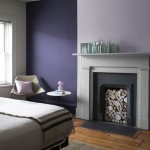
I found the picture frame at the left when I was cruising around the internet.  It was pretty much the type of frame I needed for a particular project I had in mind.

However, there were two problems:  first off, the frame I found, the one in the picture here, came in that color green.  And that’s the wrong color green.  I needed a slightly darker, less olive green than what’s pictured here.

But that’s not important.  Color’s not important, because the second problem with this frame was that the asking price was . . . wait for it . . . $120.  Yes.  Apparently, the child in the photo comes with the frame.

Needless to say, when I saw the $120 price tag, I quite naturally backed off and closed the computer down for fear that I might mistakenly bump a couple of keys and put that obscenely-expensive frame into “my cart.”

A couple days later, I was back, looking for more frames.  And I found them.  And this time, they were a real bargain:  only $40.  They looked nice and were mostly (again) what I wanted . . . though the colors weren’t perfect and the price was still (in my opinion) high.

I was just about to toss them into “my cart” when inspiration hit me:  I work at RepcoLite.  I deal with paint all day long.  Why in the world would I buy a frame like that for $120 or even for $40 when I could turn a frame I already own into the same thing for free?

See, I’ve got the perfect frame at home–it’s just got a gold-leaf look to it and I don’t want that anymore.  I also have a couple quarts of two different greens at home because I painted a dresser earlier this year for the same room.  From there, I put it all together and came up with a great, quick, simple, money-saving project that I’m going to pass along to you as today’s “Quick Hitter.”

What You’ll Need:

  • 2 quarts Hallmark Ceramic paint in your desired colors (check your basement shelves or stop out at RepcoLite!)
  • 1 can of flat black spray paint
  • 1 picture frame
  • Sandpaper
  • Brush
  • 3M Safety Release Blue Painter’s Tape
  • Old newspaper or a plastic dropcloth to protect your work area.

How to Do It:

This project is about as simple as it gets.  Just start by doing a light scuff sanding of your picture frame (with the glass removed, of course).  Just dust over it to take some of the shine down–you’re not trying to bring it down to bare wood!

Once you’ve done that, wipe it clean with a dry rag.

After wiping it down, place the frame on a large sheet of plastic and spray paint it lightly with your FLAT black spray paint.  Don’t try to make the first coat cover if it doesn’t seem to want to.  Multiple light coats are much better than a single heavy coat.

Once the frame is coated solidly black and is completely dry, take your lighter color of Hallmark paint and apply it to the entire frame.  If you need a second coat, apply it when the first coat has finished.

Now, once that initial color has dried (overnight to be safe), take your special 1″ Safe Release 3M Painter’s Tape (you’ll notice it should have an ORANGE cardboard core) and apply it in straight lines down your frame.

To mimic the look of the frame above, just run the tape down the parts or areas of the frame where you want the original color–the lighter color you first painted–to show through.  Leave the other areas untaped and  paint over them with your darker color.  As soon as you’ve finished, carefully remove the tape.  You don’t want to pull it too quickly or it could lift your original coat of paint off.  (And, just a quick note:  that’s why we recommend using 3M’s Safe Release Blue Tape.  Any other tape is lightly going to cause problems).

Once you’ve removed your tape (and have let the frame dry), you should have a chic, hip and happening striped frame that you can incorporate into your decorating.  If you want to get fancier yet, go ahead and scuff the frame slightly to distress it, bringing out the undercoat of black along the edges.

Conclusion and Suggestions

Now, possibly, this project sounds complicated and long, but let me assure you:  it’s not.  You should be able to easily accomplish it with a total work time of about 1 hour per frame (at the very most).  Doing multiple frames at the same times will also save you a fair amount of time.

And finally, if you decide to give this project a try, go ahead and get creative beyond the scope that I’ve already described: Alternate the color patterns on multiple frames, vary the sizes of the stripes.  Run the stripes up and down on some frames and side to side on others.   Overall, just have fun with it and realize that with the right paint and a little creativity and energy, you can duplicate almost anything you see at a home decor store–for pennies on the dollar!

Quick Project: Framed Handprints

blueframe_handprint

If you’re looking for a quick project that can make a huge impact in a room, check this one out!

What You’ll Need:

  • 1 Quart Hallmark Ceramic Matte Paint from RepcoLite (it’s the best, afterall!)
  • 1 Quart RepcoLite’s Prime-All Waterbased Primer
  • 1 picture frame
  • 1 scrap of wallpaper (or decorative paper) big enough to fit in frame
  • A few sheets of heavy-duty artist paper
  • Some old newspapers (to protect your work area)
  • An old paper grocery bag
  • Double-sided tape or photo adhesive

How to Do It:

This is a great project that will take you very little time, but that will pay off big in terms of visual “pop” in your home.

Just start with a standard picture frame. If it’s already stained and finished, then do a light sanding with some 150 grit paper and prime with RepcoLite’s Waterbased Prime-All primer. Once it’s dry, apply the Hallmark Ceramic Matte finish paint in whatever color you selected using either a roller or a brush.

Set the frame aside to dry (with Hallmark, it will only take about 30 minutes or so to dry).

While the frame is drying, take your scrap of wallpaper or your decorative paper (picked up cheaply at any hobby store with scrapbooking supplies) and cut it to fit inside the frame.  (A simple way to do this is to save the paper insert that came with your frame.  Use this as a template).

Anyway, cut the wallpaper or decorative paper to fit the frame and set it aside.

Once you’ve got these things accomplisblackframe_handprint2hed, it’s time to create the handprint in the center.  Now, this is not a difficult process, but there are a few things to know that will make your results turn out well.  First, you’ve probably seen this done before (at school) where the handprint is “globby” and, well, for lack of a better word…ugly.  The reason this happens is because kids usually mash their hands down on the paper while they’re covered with way, way, WAY too much paint.

The easy way to fix that is this:  carefully brush the paint you used to paint the picture frame onto your child’s hand (if you’ve used Hallmark Ceramic, it’s perfectly harmless–though you will want to supervise for obvious reasons).  Making sure your child doesn’t touch everything in site or eat the paint, help your child press his or her hand onto a paper grocery bag.  Do this a number of times until you start to see a clearly defined handprint.  Once you get to that point, shift from the paper bag to the sheets of heavy duty white artist’s paper.  Help them firmly press their hand onto the paper and then help them lift their hand off without smudging the print.

Maybe make a couple just to be sure you get a good one and, while those are drying, wash your hands and clean up your supplies.

When everything’s dry, cut the handprint paper down and tape it or affix it using photo adhesive to the center of the wallpaper scrap.  Mount everything in your frame, hang it up and there you go:  something cool, something unique, something that will serve as a great memory and something that will add some visual pop and interest to your room!

Meet Michael Mayosky, ArtPrize Artist

mayosky_5This week, I’ve been spotlighting some of the ArtPrize artists who RepcoLite was fortunate enough to work with during this year’s contest.  Today, I want to show you some of the work done by Michael Mayosky.

Michael’s from Illinois and he’s tackled one of the most ambitious ArtPrize projects I’ve seen:  a 5-story mural on the side of the Goodspeed Lofts building on Grandville Ave. in Grand Rapids.

I stopped by and spoke with Michael yesterday and was surprised to hear that none of this painting was worked out ahead of time–none of it.  He simply pulled into Grand Rapids a couple weeks ago, took a long look at the side of the building and started painting what came to mind.

It’s an amazing piece and it’s easily going to be one of the highlights of ArtPrize this year.  Be sure to get there and check it out in person.  But, in case you can’t make it . . . or to whet your appetite . . . here are some shots of the work in progress.

Mayosky_mural3

Mayosky_mural2

mayosky_5