Let Them Help: Decorating With Your Kids’ Input!

paint_handsEvery now and then I hit upon something that I know is a good idea. And, though this doesn’t happen very often, this is one of those times. There’s no way around it: decorating your kids’ rooms with their help is a great opportunity for you and for them. Oh, I know there are lots of little bugs in the idea and potential complications–but that doesn’t change the fact that it’s a good thing to do.

Taking a room that was decorated with younger kids in mind and turning it into “hip, way cool pad” is a great way to let your kids know that YOU know that they’re growing up. Taking down the wallpaper borders of stuffed bears and turtles and replacing it with something more age-appropriate will make your kids feel important. And involving them in that process, seeking their input and listening to their suggestions will make them feel that they are on the path to growing up–they’re actually an active force in the creation of their new room.

Surprise Makeovers are Cool on TV, But Not So Much In Real Life

If you still need convincing that it’s a good idea to involve your kids in the process, then think about it this way: on TV, surprise makeovers are cool. They really are. But that’s because we don’t normally watch the recipient of the new room beyond their initial reaction. We see them when they first whip off a blindfold and stand blinking and squinting in the bright lights as they try to take in their new surroundings. Everybody’s happy and giggly and the show ends. We don’t see the couple standing there 12 hours later, now that the cameras and energetic TV personalities are gone, staring at the new walls and wondering what happened and how anybody ever thought that bright orange was a good look.

Your kids feel the same way about their room as you would about your home. Their room is their space–their world away from the world, especially as they get older. Just as you wouldn’t likely appreciate it if your husband or your neighbor just dropped by one afternoon and repainted your living room in colors of their choosing, neither will your kids necessarily be receptive to the changes you bring about one day while they’re off at school. Your vision for their room isn’t necessarily their vision for the room. You’ve got to make it your goal to discover a mutually acceptable vision.

Involve Them, But Remember Their Limitations

To that end, involve them in every aspect of the process. Take them to the store and let them look at colors. Let them flip through wallpaper books and mural books. Let them explore the world of Faux Painting. However, make sure that you keep the outings short and sweet–no marathon shopping trips that will frustrate and wear your kids out. Remember that their attention spans are not like yours–keeping the trips to a limited amount of time will make sure both of you enjoy the outings. And don’t forget to think bigger than just a trip to the paint store or the furniture store: try to tie your decorating trips in with a nice dinner out or something like that.

Taking the kids to the paint store and listening to their suggestions and then taking them out to dinner will be one of those special moments kids remember. If you treat their opinions as valid options and listen to their thoughts and take the time to discuss things with them over dinner, they will start to feel like an intricate part in the decision process. And trust me, I may have young kids and I may not have had much experience in the world of psychology, but I know this is a good thing. You don’t have to be a genius to see that by involving your kids in something so small as decorating their rooms, you’re basically telling them that their opinions matter and that you value their thoughts.

What If . . ?

Alright, now you’re probably thinking that I’m living in a world where everything is puppy dogs and lollipops. Sure it sounds good to involve the kids in the decorating process, but what’s going to happen when they pick out Sponge-Bob Yellow and Bright Red for their walls?  We’ll cover that in the next post.

Decorating Made Easy: Decorating with the 60-30-10 Rule

The 60-30-10 rule is a tested concept used by interior decorators everywhere.  It’s a simple proportion that spells out the ideal amounts of color to use in your decorating.

To keep it as simple as possible, 60% of your room should be composed of your dominant color, 30% should be composed of a secondary color and that final 10% should be reserved for accents.  Now, maybe that sounds a little confusing . . . so here are some examples:

This room is a perfect example of the 60-30-10 rule in practice. 60% = Lavendar (walls and blanket) 30% = White (bed and fireplace) 10% = brown/tan (chairs, dresser, floor)

This room is a perfect example of the 60-30-10 rule in practice.
60% = Lavendar (walls and blanket)
30% = White (bed and fireplace)
10% = brown/tan (chairs, dresser, floor)


Another great example: 60% = Tan (walls, floors) 30% Brown (couch, tables) 10% Blue and White (pillows, vases, etc.)

Another great example:
60% = Tan (walls, floors) 30% Brown (couch, tables)
10% Blue and White (pillows, vases, etc.)


A classic example showing that you don't need a soft, muted color on your walls to make this work. 60% = Red (walls, accessories) 30% = Cream (furniture, rug) 10% = Tan (floor, accessories)

A classic example showing that you don’t need a soft, muted color on your walls to make this work.
60% = Red (walls, accessories)
30% = Cream (furniture, rug)
10% = Tan (floor, accessories)


Another great example that clearly demonstrates that the main color doesn't need to be calm, simple, neutral or BORING! 60% = Green (walls, accessories) 30% = White (furniture, art prints) 10% = Dark Brown (floors, chair legs)

Another great example that clearly demonstrates that the main color doesn’t need to be calm, simple, neutral or BORING!
60% = Green (walls, accessories)
30% = White (furniture, art prints)
10% = Dark Brown (floors, chair legs)

 An example that proves you can use the 60-30-10 rule to work incredibly vibrant and bold colors smoothly into your decorating. 60% = Blue (walls, light) 30% = Pink (bedspread, chair, painted leaves) 10% = White (trim, doors)

An example that proves you can use the 60-30-10 rule to work incredibly vibrant and bold colors smoothly into your decorating.
60% = Blue (walls, light)
30% = Pink (bedspread, chair, painted leaves)
10% = White (trim, doors)

The color options are endless and it’s not difficult to see that using this rule helps you keep your color scheme under control and helps you produce an end result that’s very focused, very clean and very inviting!

Get Creative! Projected Images, Stencils, and Silhouettes

jenisonBy Guest Writer, Shannon VandenBosch

When it comes to creativity, I need some inspiration.  So I go to a few decorating magazines and/or peruse my “Favorites” list of websites for design ideas.  When I feel I have found a few pictures representing the style, image, or technique I would like to achieve, it becomes my muse.  This is when I breathe a sigh of relief because the mental work is done and I can begin the process of tweaking the look I have found in order to make it my own style statement.

Recently, I was challenged to take a blank wall in our recently remodeled RepcoLite store in Jenison, Michigan, and create interest, and hopefully, inspiration.  This empty wall space was located directly above the counter area where customers would sit and contemplate their own design decisions by beginning to choose a color or palette of coordinating colors.

Immediately, I liked the concept of stenciling or projecting an image on the wall to create a mural.  I recalled seeing a large, abstract, flower in a Benjamin Moore color brochure.  Aha!!  The inspiration, my muse!

I began by taking measurements of the wall space and calculated the size of a single petal needed to make the flower, the length the stem needed to be, and the size of a single circle.  Color choices were made to compliment the store’s interior decor.  The single petal and circle were cut out of cardboard and then stenciled or traced onto the wall.  The stem was drawn free-hand in proportion to the flower. Then the image was painted with interior wall paint. The whole process took about 6 hours. (See picture above–or, better yet, stop at our Jenison store and see it in person!)

As alluded to earlier, other ways to create murals is to use a projector to cast an image on a wall and either trace it and then paint or begin painting the image . Click here and here for more info.  You can also check out this site for some more examples of graphic murals. Silhouettes are created by drawing and then painting a picture of something, say a headboard, on the wall instead of actually using a real headboard. This technique is not only creative, but inexpensive! Take a look at current decorating magazines for more information on this technique. Stencils not only can be made but bought at local stores that sell wallcoverings, crafts, or interior decorating items.

I hope you have been inspired to get creative and make the next space you choose to decorate even more uniquely yours.

A Little Color Here, A Little Color There

Many times, people think that in order to create a room with some “visual pop”, they’re going to need to pop open a gallon of Safety Orange paint and roll it all over their walls.

We tend to view that big transition from the world of “neutral” to the world of “color” as being . . . for lack of a better word . . . violent.  And not everybody is up to the challenge.  Not everybody has the intestinal fortitude to make such a bold shift.  And so, as a result, there’s often a feeling of frustration that builds in the home decorator who’s trying to make the change.

There’s the desire to step out into the world of color, but there’s the fear they will go too far, lose control of the color and  let it overpower their room.

And so, in the end, what often happens is this:  the people on the verge . . . the ones who’d like to bring in color, but who are a little nervous, usually end up reverting to whatever was on their walls in the first place.  Maybe they try for a darker tan than they had before, but typically, they stay in the same, safe color range.  When the room is finished and the new paint is dry, they often feel a little sense of disappointment–it doesn’t look terribly different from the original.  It’s safe.  It feels boring and blank.  And yet the alternative–walls splashed with Fuschia and Teal and Turquoise and Lime Green–seems too crazy, too schizophrenic.  And so, they come to despise home decorating projects.

Well, if you’ve ever found yourself in that place–if you’ve ever wanted to step out boldly with color, but have been too nervous to try it . . . well, I’ve got good news:  It can be remarkably easy and, most importantly, SAFE.  All you need to do is this:  bring your color in with accessories.

It’s a simple solution and it’s used by Designers and Professional Decorators all the time.  It’s the ideal way for those just stepping into the world of color to get their feet wet.  You simply find a nice, calm, reasonable, safe neutral tone for your walls and then spice it up with accessories.

Paint some of your boring picture frames bright pink and green.  Maybe stripe a couple of them and mount them.  Or maybe, take a look at your dresser.  Maybe you don’t want to paint the whole thing, but what would happen if you painted two of the drawers?  Or, what if you’d paint just the top?

green_room
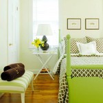
Pick up some simple shelves and splash them with a bright color and you’ll be amazed how much character they display.  These simple, boring, run-of-the-mill shelves suddenly look like designer pieces when we see them in a pink or a bright yellow.

And what about that boring lamp on the desk?  What if you’d paint the base white or neutral and then pick up a bright lampshade?  Or, reverse that:  keep the lampshade white and simple and paint the base a bright color.

One of the most impressive uses of color in a small room that I’ve ever seen is pictured above.   They made perfect use of this concept:  the walls are a light, neutral green.  They’re safe.  Simple.  Dangerously boring.  But then, the designers added the dark brown bedspread and the brown picture frames.  These constituted another earthy color, another safe choice, but they added to the overall effect.

The bench with the darker green stripes goes even farther towards adding some visual interest, but I think it’s easy to see that even then, the whole room has a very safe feel to it.

And then there’s the bed.  The bright green on the bed suddenly gives the room a shot of life.  It makes it vibrant, exciting . . . the kind of place you walk by and then walk back to so you can take a longer look.

And the reason it works so well is twofold:  first, the green is so bright and bold that it instantly grabs your attention.  Secondly (and more importantly), the green is in the last place we’d normally think to look.  In a normal situation, the bed might be brown and the frames might be lime green along with the legs of the bench.  And if that were the case, I don’t think the room would have it’s flair . . . it wouldn’t make the statement that it does here.

But instead of doing that, these designers “messed with” our expectations and, in so doing, by putting the color in the last place we’d expect to see it, they created something that really stands out. The color in the room isn’t overpowering, but the intelligent, controlled use of the bright green pumps vibrant life into the setting.

And that’s what I’m talking about.  You don’t need to go crazy and cover your walls with  circus colors in order to spruce up your rooms and infuse them with energy.  You can do it through accessories, through the compelling choices of bright colors and interesting items, through the intelligent, well-thought out placement of these colors in areas we might not usually expect them.  Remember, you don’t need a room full of color to make a statement.  You just need the right colors in the right locations.

Decorating Kids’ Rooms: They’re Only Young Once!

bigstock-Super-hero-flying-some-motion-64086529
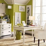
There are few places in your home where you can really cut loose and have a good time with color as much as you can in a kids’ room. When it’s your bathroom or your living room or a dining room we all tend to be a little more cautious.  We don’t want to go nuts and create something on the walls that will drive us crazy or overpower our other decorating.

However, in a kids’ room, we really don’t have to worry about those things.  Because really, with rooms for children, the crazier and more bold you go with your color choices, the more people will think you’re a really cool parent!

It’s amazing how it works:  do that crazy stuff in your living room and folks think you’re “over the top” or “gaudy.”  Put some bold colors in a kids’ room and suddenly, you’re “Hip Parent of the Year.”

And really, it’s a “win-win” proposition.  Sure, other people will think it’s great and fun and amazing–but really, is that all that important?  No, the real benefit will come from the fact that your kids will gain so much from a project like this. They’ll be excited about the new look, excited about the colors you’ve brought it, and you’ll give them a place of their own–a place that looks completely untouched by the boring, drab world of adults.

Sure, it’s not terribly easy to reconcile yourself with the thought of moving from nice, neutral earthtones into something bold and wild . . . but your kids will thank you for it.  And honestly, remember this:  they’re only young once!  Have fun with it while you can!