From afpinteriors.com
Many times, people think that in order to create a room with some “visual pop”, they’re going to need to pop open a gallon of Safety Orange paint and roll it all over their walls.
We tend to view that big transition from the world of “neutral” to the world of “color” as being . . . for lack of a better word . . . violent. And not everybody is up to the challenge. Not everybody has the intestinal fortitude to make such a bold shift. And so, as a result, there’s often a feeling of frustration that builds in the home decorator who’s trying to make the change.
There’s the desire to step out into the world of color, but there’s the fear they will go too far, lose control of the color and let it overpower their room.
And so, in the end, what often happens is this: the people on the verge . . . the ones who’d like to bring in color, but who are a little nervous, usually end up reverting to whatever was on their walls in the first place. Maybe they try for a darker tan than they had before, but typically, they stay in the same, safe color range. When the room is finished and the new paint is dry, they often feel a little sense of disappointment–it doesn’t look terribly different from the original. It’s safe. It feels boring and blank. And yet the alternative–walls splashed with Fuschia and Teal and Turquoise and Lime Green–seems too crazy, too schizophrenic. And so, they come to despise home decorating projects.
Well, if you’ve ever found yourself in that place–if you’ve ever wanted to step out boldly with color, but have been too nervous to try it . . . well, I’ve got good news: It can be remarkably easy and, most importantly, SAFE. All you need to do is this: bring your color in with accessories.
It’s a simple solution and it’s used by Designers and Professional Decorators all the time. It’s the ideal way for those just stepping into the world of color to get their feet wet. You simply find a nice, calm, reasonable, safe neutral tone for your walls and then spice it up with accessories.
Paint some of your boring picture frames bright pink and green. Maybe stripe a couple of them and mount them. Or maybe, take a look at your dresser. Maybe you don’t want to paint the whole thing, but what would happen if you painted two of the drawers? Or, what if you’d paint just the top?
 Pick up some simple shelves and splash them with a bright color and you’ll be amazed how much character they display. These simple, boring, run-of-the-mill shelves suddenly look like designer pieces when we see them in a pink or a bright yellow.
And what about that boring lamp on the desk? What if you’d paint the base white or neutral and then pick up a bright lampshade? Or, reverse that: keep the lampshade white and simple and paint the base a bright color.
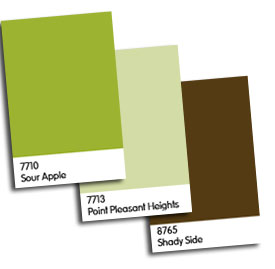
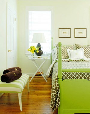
One of the most impressive uses of color in a small room that I’ve ever seen is pictured above. They made perfect use of this concept: the walls are a light, neutral green. They’re safe. Simple. Dangerously boring. But then, the designers added the dark brown bedspread and the brown picture frames. These constituted another earthy color, another safe choice, but they added to the overall effect.
The bench with the darker green stripes goes even farther towards adding some visual interest, but I think it’s easy to see that even then, the whole room has a very safe feel to it.
And then there’s the bed. The bright green on the bed suddenly gives the room a shot of life. It makes it vibrant, exciting . . . the kind of place you walk by and then walk back to so you can take a longer look.
And the reason it works so well is twofold: first, the green is so bright and bold that it instantly grabs your attention. Secondly (and more importantly), the green is in the last place we’d normally think to look. In a normal situation, the bed might be brown and the frames might be lime green along with the legs of the bench. And if that were the case, I don’t think the room would have it’s flair . . . it wouldn’t make the statement that it does here.
But instead of doing that, these designers “messed with” our expectations and, in so doing, by putting the color in the last place we’d expect to see it, they created something that really stands out. The color in the room isn’t overpowering, but the intelligent, controlled use of the bright green pumps vibrant life into the setting.
And that’s what I’m talking about. You don’t need to go crazy and cover your walls with circus colors in order to spruce up your rooms and infuse them with energy. You can do it through accessories, through the compelling choices of bright colors and interesting items, through the intelligent, well-thought out placement of these colors in areas we might not usually expect them. Remember, you don’t need a room full of color to make a statement. You just need the right colors in the right locations.

